Two years as the sole designer on a document wallet. Part one is the consumer app and the two AI features that gave it revenue, taken to over a million document saves. Part two is UDI, the document exchange built on top of it, which was sold to Indian consumer lenders and is still running.
Zoop Wallet stores personal documents. People keep them the way they receive them: a passport scan in the camera roll, an insurance PDF in email, a certificate downloaded once and never found again.
Nobody opens a document wallet for fun. They open it in a hurry, which means the app is judged on how little it asks of them.
None of that made money. My brief was to find features the business could charge for, inside a product whose entire value was staying out of the way.
Those two facts pull against each other. That tension decided most of what follows.
Everything on this page follows one sequence: make the wallet understand what it is holding, charge for the part that costs money to run, then use that understanding to do something no filing app can do.
The consumer app, and the two AI features that became its first revenue.
A wallet that only stores files is a folder with a logo.
The decision underneath this project was that the wallet should understand each document: which of seven categories it belongs to, whether it is government-verified, and when it stops being valid.
That costs more to build than storage and is harder to get right. It is also the only version that can do anything useful later, which is the argument I would make again.
Government records are verified through DigiLocker. Everything else has to be identified.
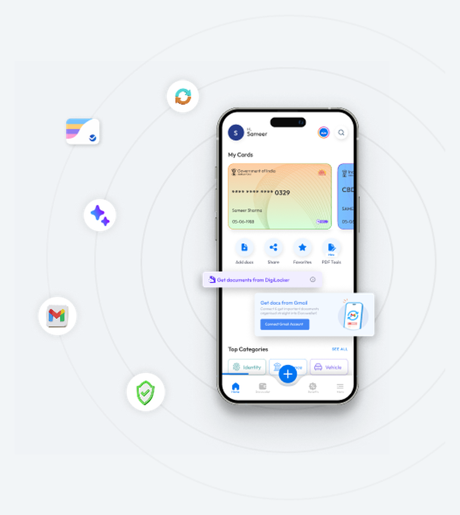
When a document is saved, OCR reads it, identifies which category it belongs to and files it there. It also reads the dates, so the wallet knows when a document is close to expiring.
Why this was the thing to charge for. Running a model on every save costs money per use, so the feature’s cost scales with how much someone uses it.
That maps onto a premium tier in a way most features do not. It is why Smart Assist sat behind the paywall rather than something more visible, and it became the app’s first revenue-generating feature.
The part I would defend hardest is the expiry detection. Automatic filing saves a few seconds. Knowing a document has gone out of date gives the product a reason to contact you when you need nothing.
That is the only way a utility app stays on a phone. It is also what made part two possible.
The model is sometimes wrong, so the suggested category stays visible and changeable until the save completes. The choice is never buried behind a confirmation the user has already tapped past.
Most documents do not start on your phone. They arrive by email: a test result, a visa, a boarding pass, a statement.
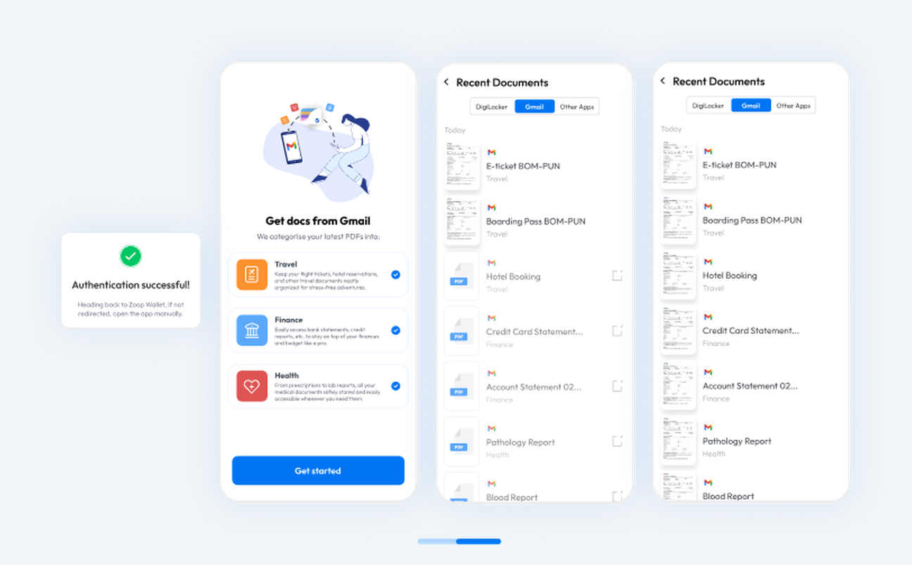
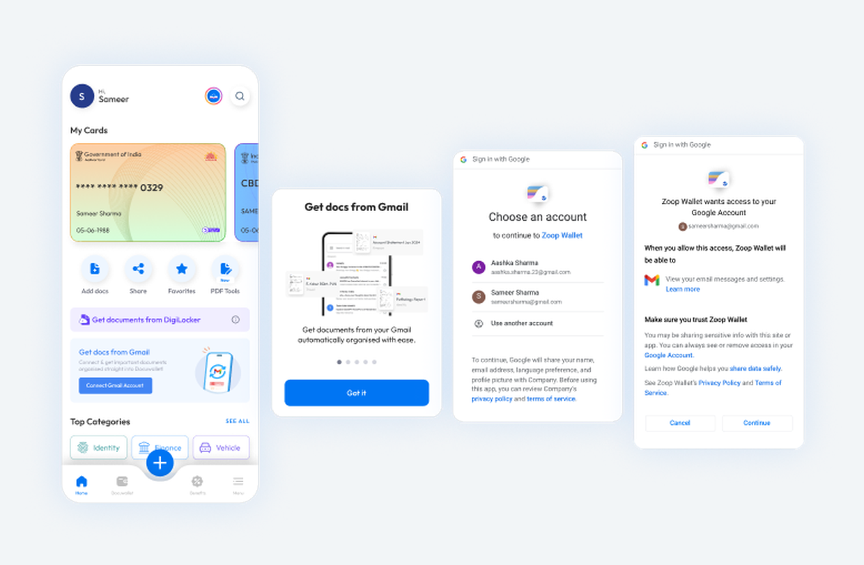
Gmail sync connects the inbox so those attachments are recognised, categorised and filed as they arrive.
Reading someone’s inbox is the largest thing this product asks for, so the design weight sits after the connection, not before it.
Permissions are set per category: travel documents can be let through while health documents are kept out. Those controls stay on the screen that connected the account rather than retreating into settings.
The screen that turns the sync on is the screen that turns it off.
The entry point is a card in the existing home screen list, not a banner or an interstitial. A feature the business wants does not get to buy itself a new surface.
Pause Sync?
Documents received in your Gmail going further will not be added into Docuwallet.
It names what stops arriving, which beats asking whether you are sure. But it does not say what happens to documents already saved, and that is the question a person actually has.
The smallest change I would still make:
Pause Gmail sync?
New Gmail attachments will stop importing. Documents already saved will remain.
Over a million document saves, and the app’s first revenue.
Smart Assist and Gmail sync shipped. Smart Assist became the first revenue-generating feature in the product. The million-plus saves figure is whole-wallet, from the company’s analytics.
A unified document interface. UPI gave payments one way to ask. Documents had none.
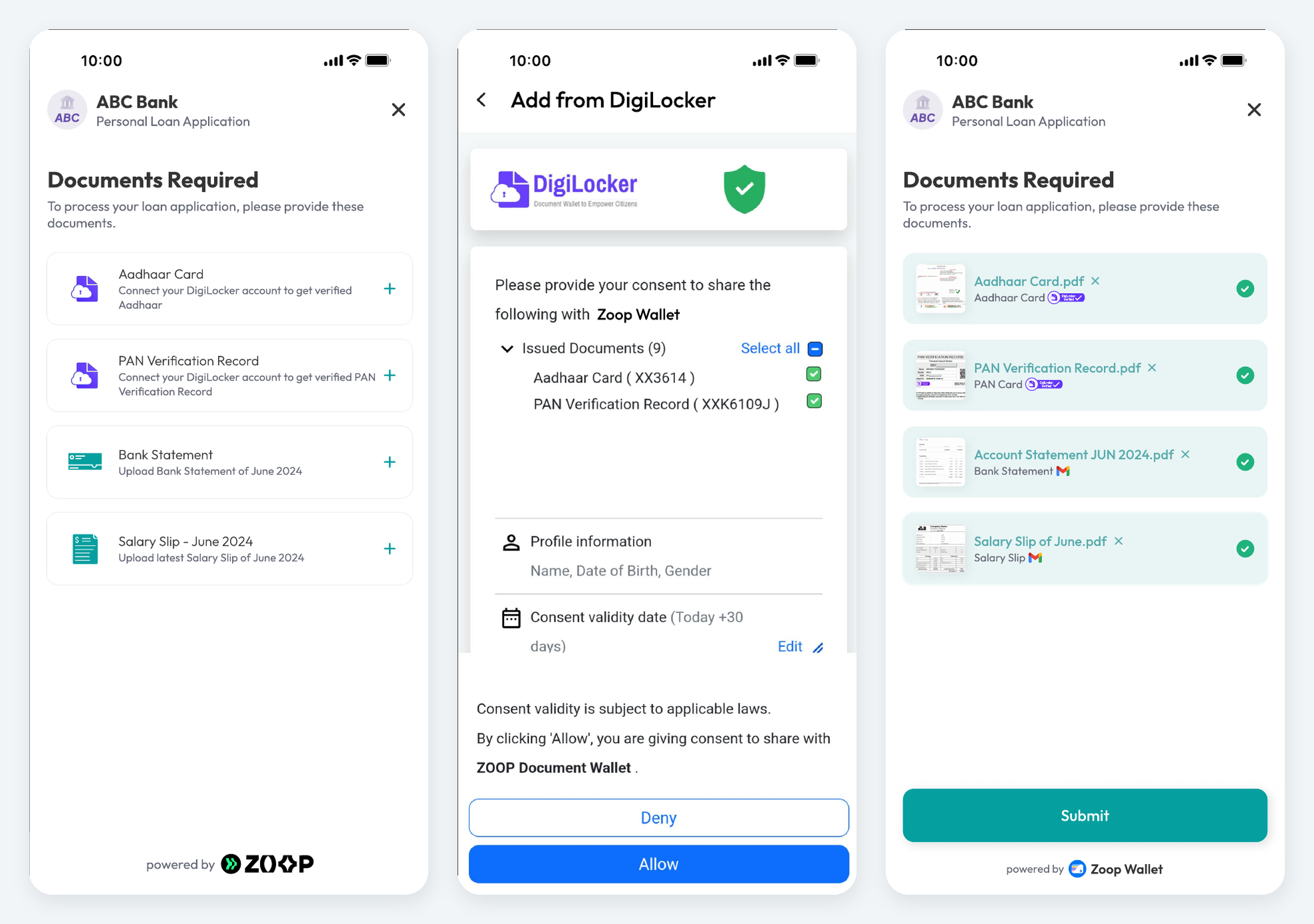
Apply for a student loan in India and the lender hands you a list: birth certificate, tax returns, utility bills, grade sheets, bank statements. All originals, all verified.
You find them across WhatsApp, email, your phone and DigiLocker. You download, rename, submit. The lender finds one wrong or out of date and sends you back. Then you apply somewhere else and it starts over.
The documents already exist and are already verified. What is manual is matching them to a request, and doing it again for every lender.
The lender stops handing out a checklist and starts sending a structured request. Because it is structured, the wallet can match it against what the person already holds.
The lender displays a code generated by Zoop. Scanning it opens the request rather than a blank upload form.
The person says what they are applying for. That choice determines which documents the request asks for.
The wallet shows which required documents it already holds, verified, and which are missing or out of date.
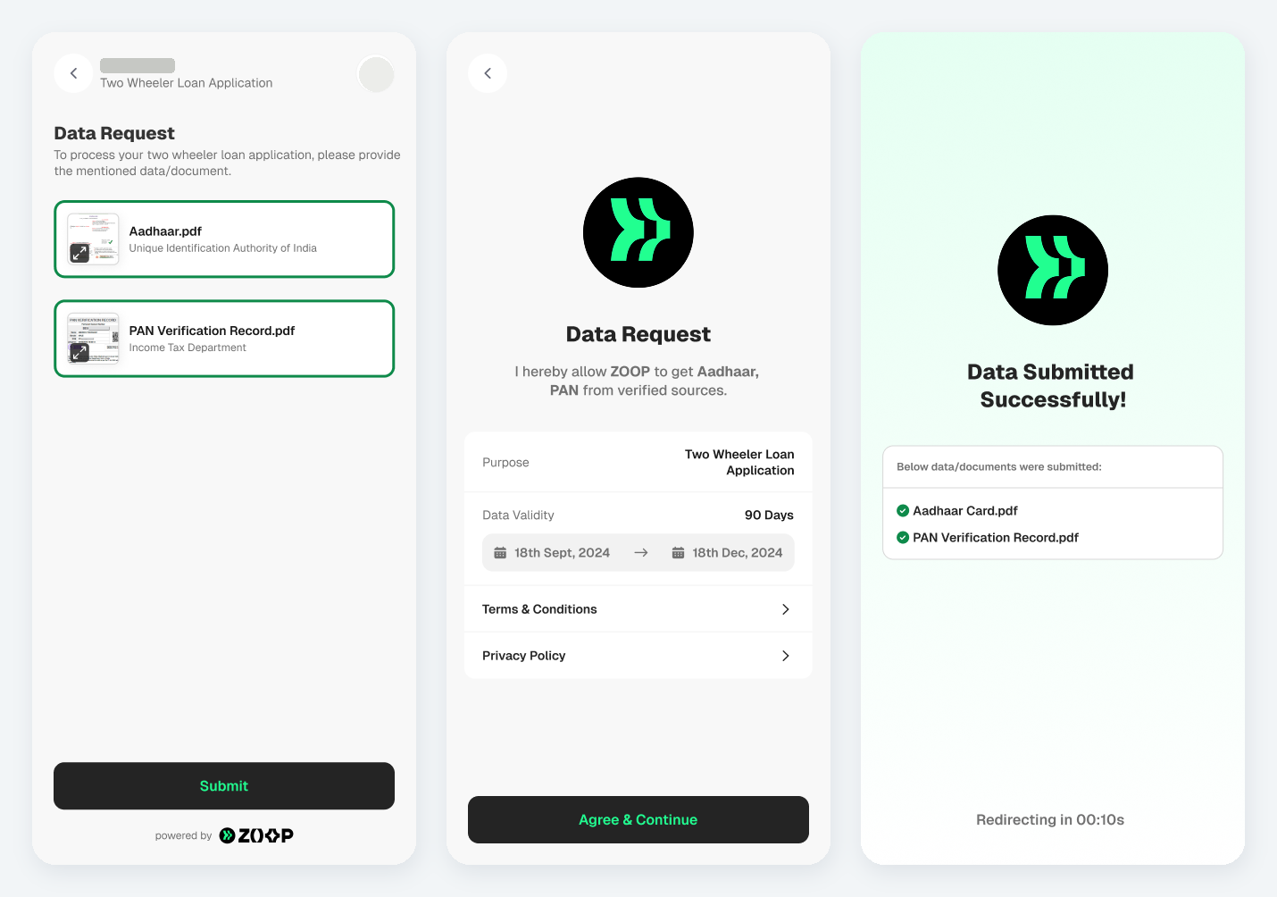
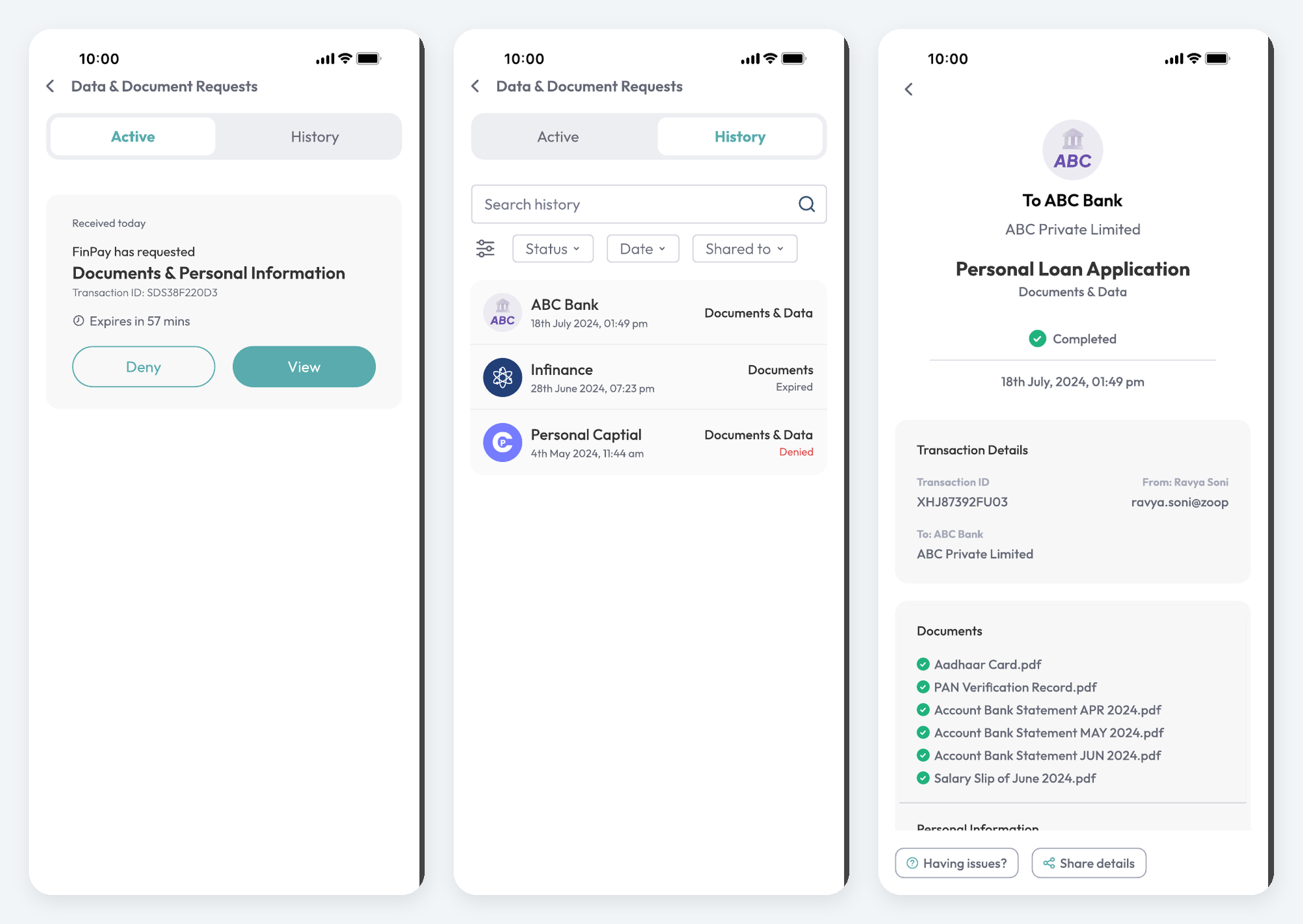
The person approves, the documents transfer, and both sides get a record of what was shared and when.
Step three is only possible because of part one. A wallet that only stores cannot answer a request. It has to know what each document is and whether it is still valid. That dependency is why the consumer app had to come first, and it is the sequencing decision I am proudest of.
The first surface is not the wallet. It is the lender’s application, with the document step handled by Zoop and marked as such, so the person always knows whose system is holding their documents.
A request can be completed, declined, or left until it expires. All three had to be specified, because the ones where a person does nothing are what decide whether a product handling someone’s documents gets trusted.
Sold to major Indian consumer lenders, and still running.
UDI went into partner application flows and was still live when I left the company. I am naming the client type rather than the companies, and not quoting contract values or client counts, because those are the company’s figures rather than mine to publish.
A million saves tells you documents went in. It does not tell you whether Smart Assist was trusted, and that is the gap I would close first.
The measure I would define before building it again is the correction rate: how often a person changes the category the model chose.
A low rate means the filing is trusted and the premium tier is earning its price. A high rate means the feature is creating work while appearing to save it, and a headline save count would hide that completely.
On the exchange, three more: how far through a request people get before dropping out, how often a required document is missing rather than merely out of date, and whether declines change when a request names the business and the purpose.
The first two say whether the wallet holds the right things. The third says whether the consent design is doing its job.
Product Consultant at Zoop.one, 2024 to 2025. Sole designer on Zoop Wallet and on UDI, across both the consumer and business sides: concept, flows, consent model, receipt and history, and the failure states.
I joined when the product was an idea with a handful of screens, and the team rebuilt it from there. I worked with product managers, front and back end developers and the AI and ML engineers, and reported to a design manager who owned the Figma files. Commercial terms and client relationships sat with the business.
Across the same period I also redesigned Zoop Stack’s B2B verification dashboard and worked on onboarding and activation in RBI and AML regulated products, resolving edge cases with engineering.
Both shipped. Smart Assist and Gmail sync were released, and Smart Assist became the app’s first revenue-generating feature. UDI was sold to clients and deployed.
1M+ document saves is a whole-wallet figure from the company’s analytics, not a Smart Assist figure. No revenue amounts, client counts or user numbers are quoted here because those are the company’s to publish.
DigiLocker for government-issued records, Gmail for documents that arrive as attachments. Each runs its own consent model, neither of which could be modified, so the design fits around both.
WhatsApp appears in the scenario as a place people keep documents. It was not a connected source.
Screens are exports from the design files I produced. On the partner request screen the client’s name and mark are redacted, and the lender shown in the collection flow is a placeholder name from the source files. The camera capture screen is not reproduced here.
Before designing the states for model-generated output, I reviewed how comparable products marked generated or AI-assisted content, how they handled loading and in-progress states, and how they named the feature. The review informed the icon, state and naming choices. It is a design reference exercise, not a published study.